Case study
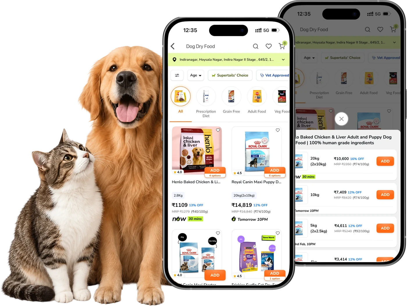
Supertails is a pet-care e-commerce app for India’s dog and cat parents. We redesigned the product card on the listing page and the variant sheet behind it: the two surfaces every pet parent passes through between browsing and adding to cart.
Pet care, e-commerce and quick delivery
We assessed the following surfaces of the Supertails app to do an in-depth analysis.
Around 12,000 pet parents open a product listing in the Supertails app every day (7-day average, app only), and every one of them meets the same card. Over time it had collected badges, attribute chips, three-line titles and a full-width Add to cart, with pack sizes tucked behind a sideways rail. We set out to understand what a pet parent needs from a card to decide from the grid, focusing on scannability, comparison, variant discovery and add-to-cart.
Four questions shaped the work, each answered by a different method.
What must a pet parent know before tapping Add?
Which parts of the old card help that decision, and which compete with it?
Which conventions do these shoppers already expect from apps they use daily?
Does a clearer card change add-to-cart and purchase?
There were a few key challenges in redesigning a card that around 12,000 pet parents see every day. To get a card that works across every category, we had to approach each of the challenges below deliberately.
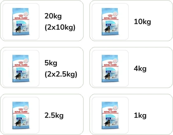
The same tile carries single-size products and dog food sold in as many as six packs, each with its own price and delivery date. Any layout had to hold for both without changing shape.
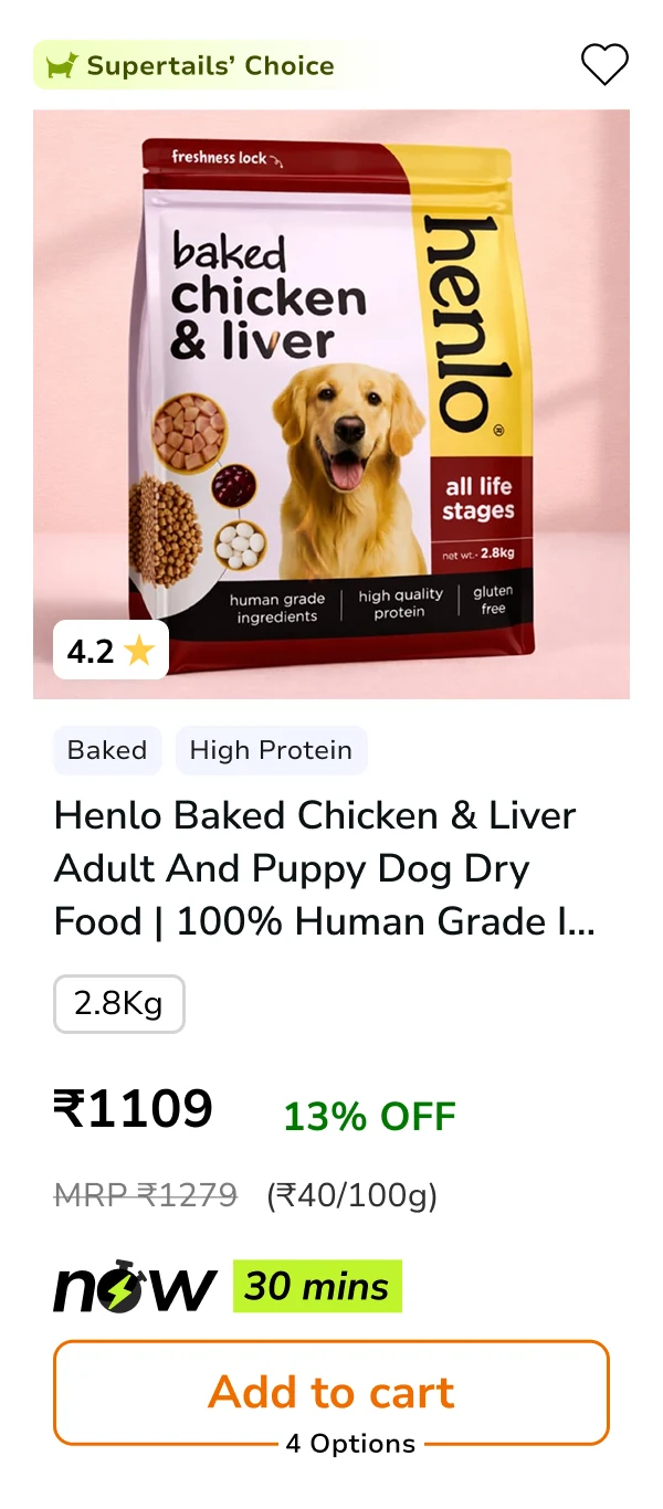
“Supertails’ Choice”, “Baked” and “High Protein” often sat above pack size and price. Taking them out of the text block meant finding them somewhere else to go.
The same pet parents use quick-commerce apps every day, and those apps have converged on nearly the same tile. A new pattern would carry a learning cost.
Each challenge got a deliberate measure: read behaviour at scale across matched windows, build the card around the questions a pet parent asks, and benchmark the tile before inventing a new one.
Control Apr 16–19 and treatment May 2–5, 2026: four days each, app only. 17,941 listing-page users in all, with every rate measured per user and tested with a two-proportion z-test.
17,941
Listing-page users
7,515
Added to cart
3,261
Buyers
To keep every card answering the same things, whatever the category, we worked backwards from six questions a pet parent asks before tapping Add, and gave each one a fixed slot.
The same shoppers use Blinkit, Zepto and Swiggy Instamart every day. We documented where their tiles agree, four conventions in all, and where pet food has to break from them: unit price, the option count on Add, and a full variant sheet.
Five pieces of work took the card from audit to launch, across the product card and the variant sheet behind it. Each one tackled a specific gap in how pet parents scan, compare and add.
We reviewed the live dog-food listing card by card, and grouped everything that got in the way of choosing into four problems.
We compared Blinkit, Zepto and Swiggy Instamart to see where to match the tile pet parents already know, and where to break it.
Six questions a pet parent asks before tapping Add, each mapped to a fixed slot. Anything that didn’t answer a question lost its place.
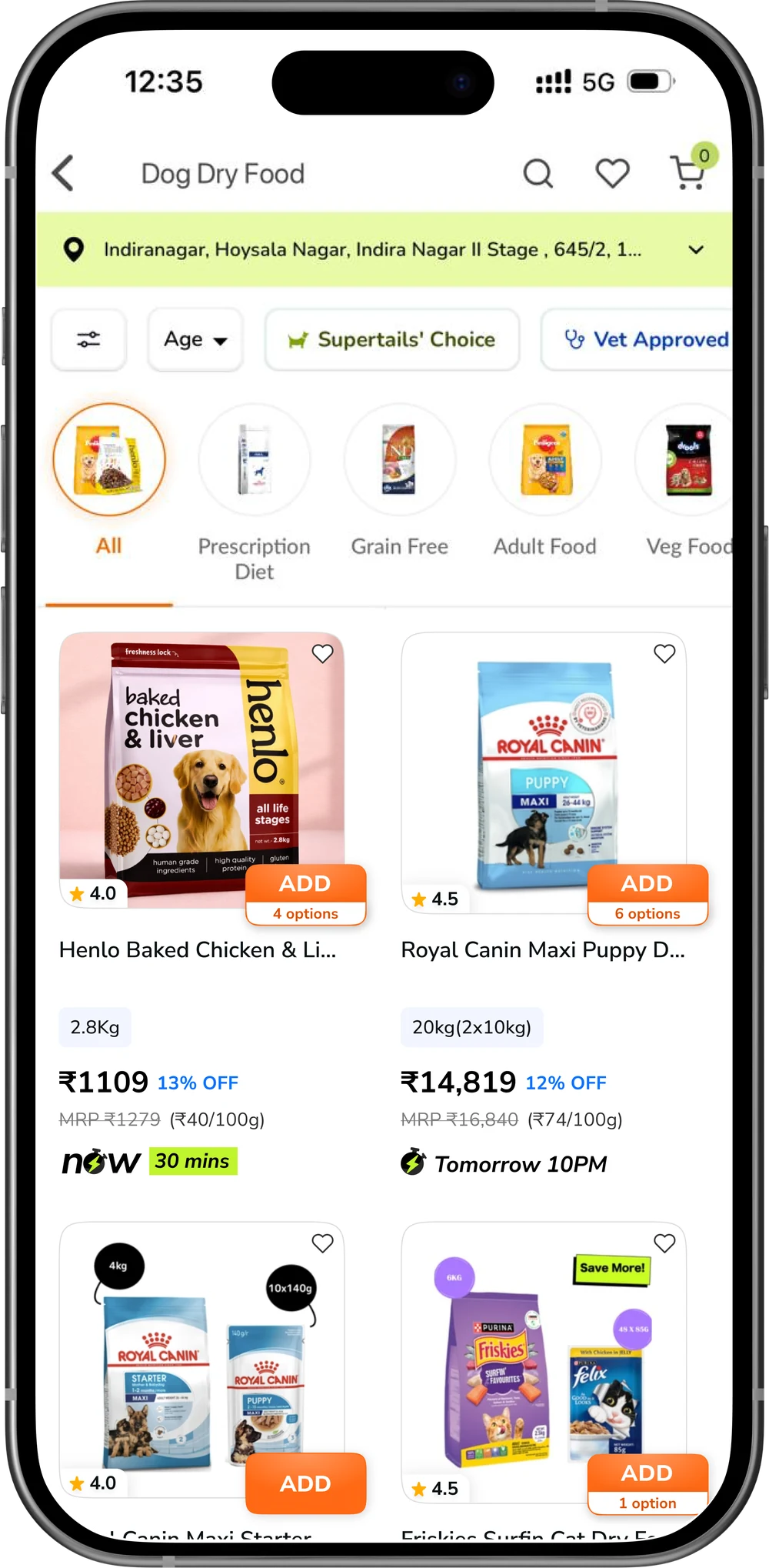
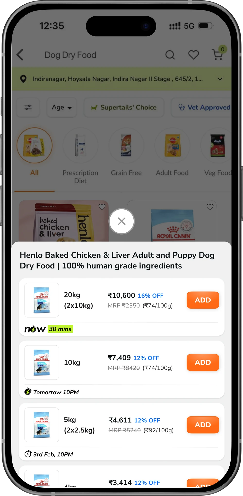
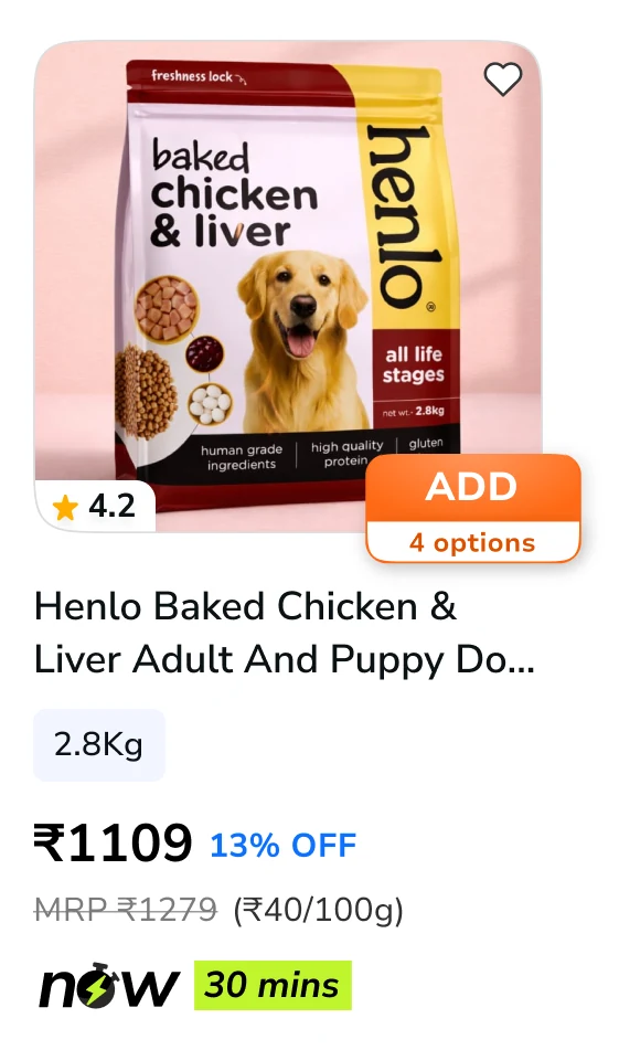
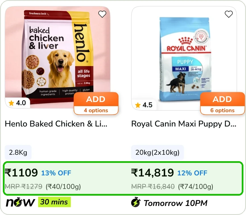
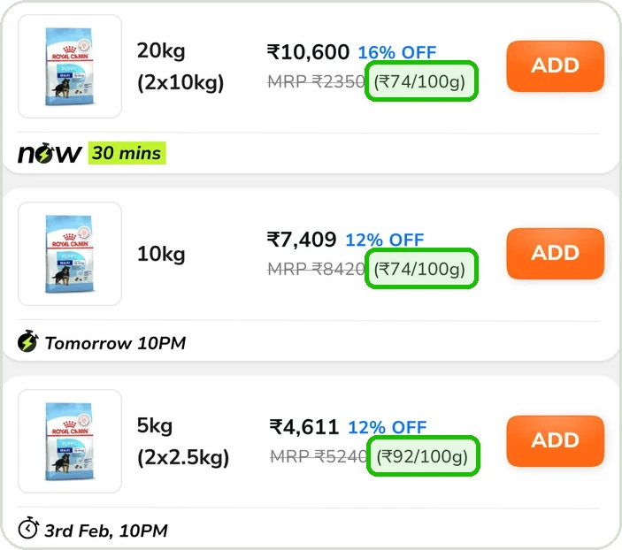
Eight fixed slots on the card, ADD moved onto the image with its option count, and a variant sheet that lists every pack in one column with its price, ₹/100g and delivery date.
Matched pre/post windows, user-level rates and a two-proportion z-test, with measured and modelled figures kept apart.
Every pet parent on the listing page meets the same card. We designed for the people behind the six questions: dog and cat parents comparing packs, who also shop quick-commerce apps every day.
Who we designed for
Two of the methods shaped the card most directly: benchmarking the tile pet parents already know, and working backwards from the questions they ask before tapping Add.
Blinkit, Zepto and Swiggy Instamart have converged on nearly the same tile. The question wasn’t what to invent. It was where to match, and where pet food forces a break.
1
2
3
4
5
6
7
8
Each slot on the card exists to answer one of them. Anything that didn’t answer a question lost its place.
What is it?
Image and a two-line title.
Do other pet parents rate it?
Rating sits on the image edge, so it costs no height below.
Which pack is this, and are there others?
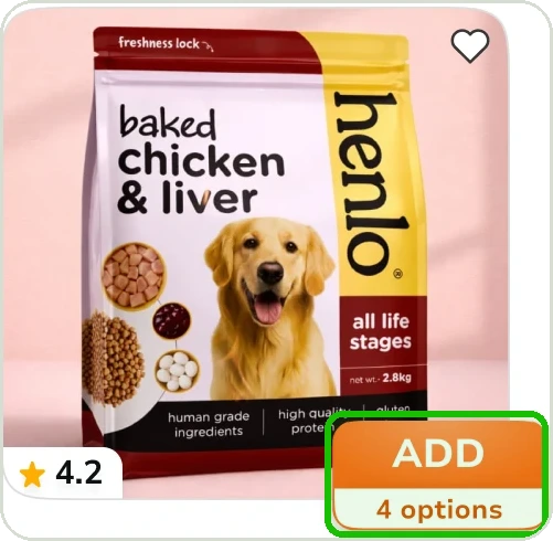
A neutral pack chip, and the option count on Add.
Is it a good price?
Price is the heaviest type; MRP and ₹/100g are one quiet line.
When will it reach me?
Delivery anchored to the base: now, next-day or a dated slot.
Can I add it from here?
A filled Add on the image, without leaving the grid.
Release data was used to read behaviour at scale: what share of listing-page visitors added to cart, and what share went on to buy, before and after the new card. Across 17,941 users, it showed where the card moved behaviour and where to look closer.
Listing-page users after launch
(May 2–5)
Thirty days on the new card (15 June – 14 July 2026) against April on the old card, app only. Figures are daily averages of users; rates divide add-to-cart users and buyers by product viewers.
| Metric | Old card · April | New card · Jun 15 – Jul 14 | Change |
|---|---|---|---|
| Product viewers a day | 11,901 | 12,913 | +8.5% |
| Pet parents adding to cart a day | 5,866 | 6,580 | +12.2% |
| Add-to-cart rate | 49.3% | 51.0% | +3.4% · p = 0.007 |
| Buyers a day | 2,335 | 2,351 | +0.7% |
| Purchase rate* | 19.6% | 19.6% | Flat |
Before/after, not an A/B test. April leaves out 4–7 April, when tracking data was missing. *Purchase rate leaves out Android 2.1.5618 and iOS 2.1.4320, two app releases with unusually low purchase rates while add-to-cart stayed normal; with them included, the new-card figure is 18.2%.
Building on the numbers, we went back to the card itself. Reviewing the live listing card by card surfaced four problem themes, and the roadblocks standing between a pet parent and Add.
4 problem themes
Hover to pause
To see how pet parents responded, we compared 30 days on the new card with April on the old one, alongside the matched release windows, and checked every card against the questions it has to answer.
Seven findings, each traced to its source in the card audit, the convention study or the release data, and the design response it led to. Open any finding to see the evidence.
What we saw
10+ elements competed on each card, making it tall.
Evidence
A badge, two attribute chips, a three-line title, pack chip, price, MRP and unit price, a delivery badge, and a full-width Add to cart with its options count.
Design response
Badges and chips dropped. The card is ~25% shorter at the same width.
What we saw
Badges, chips and three-line titles changed from card to card.
Evidence
Different badges, chips and delivery treatments shifted price, offers and other decision information around the grid.
Design response
Eight fixed slots and two-line titles, so every price in a row sits on the same line.
What we saw
The variant sheet laid pack sizes out in a sideways rail.
Evidence
The rail showed two and a half packs before the edge of the screen.
Design response
The option count sits on ADD, and the sheet lists every pack in one column.
What we saw
Dog food is sold in as many as six pack sizes, each priced differently.
Evidence
Each pack carries its own price, discount and ₹/100g. It’s the point where pet food breaks from the quick-commerce tile.
Design response
₹/100g stays on the card and on every pack row in the sheet.
What we saw
“Supertails’ Choice”, “Baked” and “High Protein” appeared before pack and price.
Evidence
The badge and two chips sat above the title, pushing pack size and price further down. Green marked both the discount and delivery.
Design response
Promotional states moved onto the image; discount in blue, leaving green to mean delivery.
What we saw
The same shoppers use Blinkit, Zepto and Swiggy Instamart every day.
Evidence
Filled Add at the image’s bottom-right, pack under the title, price before MRP, delivery at the base.
Design response
All four matched; three broken on purpose where pet food needed it.
What we saw
The redesigned card in the app, before vs after launch.
Evidence
30 days on the new card vs April: +714 pet parents adding to cart a day (+12%), with product views up 8.5% in that time. Matched release windows: listing-to-purchase up 7.3% (p = 0.026). Before/after, not an A/B test.
Design response
Shipped as is. Next: confirm it with a controlled split.
Add-to-cart rose after the redesign: over 30 days on the new card, 12% more pet parents added to cart every day and the add-to-cart rate rose 3.4%. In matched release windows, listing-to-purchase rose 7.3%. At Supertails’ scale, with 30% of the modelled lift credited to the card, that is worth around ₹90L a year.
Before/after comparisons, not an A/B test. 30-day figures compare Jun 15 – Jul 14 with April; product views rose 8.5% over that time. Listing-to-purchase compares Apr 16–19 with May 2–5 (p = 0.026). Revenue is a modelled estimate, not a measured result.